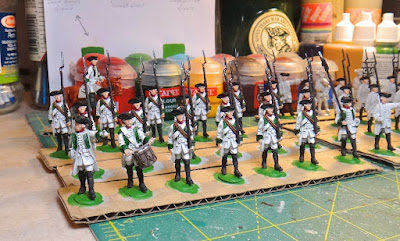
Wied Infantry In-Progress. . .


The first third, more or less, of Austria's Wied Infantry.  Still a way to go, but they don't look half bad at this point.


Since mid-June, I have been picking away at the first company of the Wied Infantry (as and when time has permitted), viewed numerous videos on Your Tube in which various wargamers around the world explain how they tackle nominally 'white' (Napoleonic) Austrian infantry, and mused about the flags I might eventually give them once all 60 or so have been painted and glossed.

I opted for a light gray undercoat followed by numerous (I have not kept track) washes of cheap white craft paint applied with a few different small brushes -- my trusty old sable 000 to a #2 synthetic round -- that have reasonably good points.  

Craft paint, because I wanted less pigment that is easier to thin way down than high pigment hobby-specific whites.  My brushes are also kept very damp.  The combination of the two makes blending somewhat easier as I build up the coats from light gray to eventual white. 

 I have finished by applying almost pure white to the front of the shoulders, uppermost backs, left forearms, and left thighs of the figures as well as the uppermost parts of the shoulder belts and edges of the waistcoats, reasoning that these areas would appear brighter due to light more likely hitting them than more recessed or lower down parts of the anatomy.

Results so far have been reasonably good.  And where I have made mistakes, it has been easy enough later to trim the light gray back into recessed areas on the odd figure or three  using my sable 000, to hide errant blotches of thinned white paint.

The green facings have been colored with Citadel's Dark Angel Green, which I might just leave alone since I tend to overdo it when highlighting darker colors.  The trick , I recall reading somewhere, possibly in one or another book on painting larger military miniatures by Sheppard Paine or Bill Horan, is to keep highlights for dark colors very sparing and subtle.  

So, possibly a dot or dash of slightly lightened Dark Angels Green on the cuff and visible lapel edges.  But no more than that.  

Lightening the dark green with a lighter tan might help more here rather than using pure white.  It might be prudent, in addition, to try the mix on a single figure before proceeding with the rest of the first 20 figures.  Decisions, decisions!

-- Stokes

Comments

tradgardmastare said…
These look great Stokes!
As I am not quite awake yet I misread your title as the word wild. I was a wee bit disappointed not to see grenzer or eighteenth century figures armed to the teeth with pistols, knives, swords and muskets in search of plunder…
David Morfitt said…
Nice work! Coming along very well. Have you decided yet what flags to give them?

Cheers,

David.
Big Andy said…
Now they do look rather sweet.
Thank you everyone for your kind words! David, I am at a loss simply because you have provided so many wonderful patterns for us these last few months. It's very difficult to choose. To paraphrase the late Freddy Mercury, I want them all.

Kind Regards,

Stokes
David Morfitt said…
Hi Stokes, What can I say? I do apologise for putting you in a quandary - but it is a sort of positive quandary at least! ;-)

Cheers,

David.
Carlo said…
That’s a wonderful combination in uniforms Stokes - white and green in Austrians always look quite striking. Beautiful looking figures, though I was incredibly distracted by all that wonderful food!

Popular posts from this blog

And We're Off!!!

  Arrrgh!  Gotta go back into camera settings on my iPhone to bring all of the frame into focus.  Blast! Painting is underway on the 60 or so Minden Austrians, which are slated to become my version of the Anhalt-Zerbst Regiment of AWI renown.  More or less indistinguishable from Austrians of the era really, right down to the red facings and turnbacks, but the eventual flags (already in my files) will set them apart.   I went ahead and based-coated all of them over a couple of days lthe last week of August, using a mix of light gray and white acrylic gesso, before next applying my usual basic alkyd oil flesh tone to the faces and hands.  In a day or two, I'll hit that with Army Painter Flesh Wash to tone things down a bit and bring some definition to the faces and hands.   As usual, the plan is to focus on about 20 figures at a time, splitting the regiment roughly into thirds along with the color party and regimental staff.  Depending on ...

Sunday Morning Coffee with AI. . .

    A rmed with a second cup of fresh, strong coffee, I messed around a bit this morning with artlist.io using its image to image function in an attempt to convert my hand-drawn map from September 2006 to something that more resembles an old map from the mid-18th century.  And just like my experiments with Ninja AI in June, the results are mixed.   The above map is pretty good, but Artlist keeps fouling up the place names and has trouble putting a faint overlay of hexes across the entire area.  Hexes, admittedly, are not likely to be found on any genuine maps from the era in question, but there we are.  Frankly, I prefer the appearance of the Ninja map, but there were problems getting it to correct its errors.  Grrrr.  As is the case with so much having to do with the various AI's out there now, the output generated is a direct result of the prompts entered.  For text alone, and when you develop a lengthy, highly detailed prompt, it is...

Continued Regional Map Revisions. . .

F ooled around a bit more with the revised map just before and after dinner this evening, using the Fotor app to reinsert missing text .  I also removed a few other things using the 'Magic Eraser' function, which works surprisingly well.  Now, we're getting somewhere.  I just have to figure out how to ensure that the text is all a uniform font style and maybe figure out a way to add a few bunches of trees to suggest forested areas,  Ninja AI is not always entirely cooperative to the tune of "I'm sorry Dave.  I can't do that." -- Stokes