Experiments with a Quick and Dirty Lightbox. . .

Here is the new lightbox in action, constructed with several sheets of very cheap foamcore board.    More experimentation is needed to get optimum results, but the lightbox does seem to diffuse and distribute available light much better than without it.

Some quick fooling around with a new (very inexpensive) lightbox, cobbled together from several pieces of foamcore board, and my Sony Cybershot TX20 this afternoon.  You will have seen the figures pictured in previous posts, but they were handy.  I think I need a third light, or a reflector/diffuser of some sort, in the foreground because I keep casting a faint but discernible shadow with the camera.  The focus is a bit iffy in other photos that I haven't shared here, but that would be solved by pulling out the Gun of Naverone that I mentioned in a post a day or two ago. . .  The Sony Alpha100 Digital SLR camera.  Anyway, the pictures shared here in this post are the best of this latest crop.  They seem to be brighter and much more uniformly illuminated than earlier ones.  Say goodbye to Stollenian Noir!  What do you think?


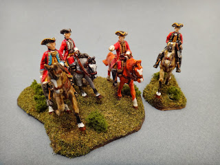
Here is our Saxon Major General once more along surrounded by his small retinue of officers.  I really like this bunch of figures although I was a bit too heavy-handed with the turf.  Ground effects always look better if the dirt and tiny rocks are allowed to show through  somewhat more than is the case here.  What can I say?  I caught and was carried away by the Woodland Scenics-itis.  Maybe that can be treated with a shot in the tookus?  You know?  The wonders of modern medicine and all.


Here, these officers remind me of the Magnificent Seven -3 riding into town here.  Can't you just imagine Steve McQueen, Horst Bucholz, Charles Bronson, and Yul Brenner in mid-18th century officers' uniforms?


This shot would be really nice with some cropping and enlargement.


You get a slightly better view of the grey steed here.  I attempted some limited and subtle dappling on the horse's hindquarters, neck, and tummy.


And finally, another photograph of the most recently finished two-figure vignette.  Can you spot the tiny detail that I missed?  And don't you just hate it when that happens?  Funny what you notice after reviewing a few photographs.  As I always say to my writing students, (better) proofreading, editing, and revision are more than half the battle.  In any case, the groundwork is, I hope you will agree, much more nuanced and effective with this particular vignette.


These figures are not perfect by any stretch, but at "wargames distance," they look pretty darn good to my eyes.


Comments

My Dear Heinz-Ulrich,
Please accept my deep appreciation for the work you undertook in building your light box. The figures you ran as a test definitely benefit from the increased, focused light. The colors look "true" and the definition of their lines has been more sharply drawn. As I often tell the staff "Increased light always benefits art!"
We will bid a sad "aufwiedersein" to Stollenian Noir although for certain efforts, like the picturing of a late night assignation, the dimmer light might be more to taste.
Wishing you a wondeful Advent, I remain,
Your brother in miniatures,
Gerardus Magnus
Archbishop Emeritus
Why, thank you Gerardus Magnus! I agree. On looking at these photos again, the colors do indeed seem to be much truer, and the full effect of using oil washes over a white undercoat comes out better. Dare I say? They almost. . . almost call to mind Doug Mason's and Peter Gilder's Napoleonic figures seen in so many issues of Military Modelling and Miniature Wargames 30+ years ago. At least that's what I'm shooting for.

Best Regards,

Stokes
Der Alte Fritz said…
The colors look nice, but the figures look a little bit out of focus or it could be a depth of field issue. Do you use a tripod when you do a photo shoot?

Jim
Bloggerator said…
I particularly enjoyed the blue of the Grenzer's trousers. They look "just right".

Greg
Thanks men. Jim, for these, I simply rested the camera on the table. I think it's a depth of field issue. I was reading more about this online somewhere last night, and one guy suggested not getting quite as close with the camera as one might be tempted to do. Apparently, there is a sweet spot of about 3-4cm. Beyond that is a bit too close unless one has a super high-end camera. In any case, it's fairly easy to crop and enlarge digital photos.

Best Regards,

Stokes
Evening Stokes,
Im going to have to get one of these boxes, it certainly improves the light, although my camera is no way as good as yours, I do hope I can improve my photographs.
Thanks for that, Robbie
Hi Robbie! Yes, by all means do so. It was easy to put together. You just need five pieces of foamcore board, some masking tape, and about 25 minutes. Completely cheap and unfancy, but it gets the job done.

Best Regards,

Stokes
Der Alte Fritz said…
I take some test shots from the same camera position and then mark a spot on the underlying paper to mark the sweet spot. It's kind of like the x mark on Jay Leno's stage..

Going forward then, I can position the figure in the optimal spot.
tidders2 said…
neat home made light-box, the pictures come up nicely; like the vignette with the grenz and hussar

I'm planning to have some vignettes to go with my Wittenberg army

-- Allan
Sean said…
It works very well and I think you are correct that adding a third light will help reduce that little bit of shadow. As for depth of field, try experimenting with the different settings on your camera. The Flower image for getting close ups will give you less depth of field. I also think 3-4cm is difficult for any camera to focus. I seem to remember more like 15cm as being the closest I could get. Zoom and post editing are your friend. I look forward to seeing your armies in their true glory.
Chris Gregg said…
Like the others I really appreciate seeing a picture of your light box; reassuringly easy and cheap to construct, and, though being no real photographer, I think your results are great.
Chris

Popular posts from this blog

And We're Off!!!

  Arrrgh!  Gotta go back into camera settings on my iPhone to bring all of the frame into focus.  Blast! Painting is underway on the 60 or so Minden Austrians, which are slated to become my version of the Anhalt-Zerbst Regiment of AWI renown.  More or less indistinguishable from Austrians of the era really, right down to the red facings and turnbacks, but the eventual flags (already in my files) will set them apart.   I went ahead and based-coated all of them over a couple of days lthe last week of August, using a mix of light gray and white acrylic gesso, before next applying my usual basic alkyd oil flesh tone to the faces and hands.  In a day or two, I'll hit that with Army Painter Flesh Wash to tone things down a bit and bring some definition to the faces and hands.   As usual, the plan is to focus on about 20 figures at a time, splitting the regiment roughly into thirds along with the color party and regimental staff.  Depending on ...

Sunday Morning Coffee with AI. . .

    A rmed with a second cup of fresh, strong coffee, I messed around a bit this morning with artlist.io using its image to image function in an attempt to convert my hand-drawn map from September 2006 to something that more resembles an old map from the mid-18th century.  And just like my experiments with Ninja AI in June, the results are mixed.   The above map is pretty good, but Artlist keeps fouling up the place names and has trouble putting a faint overlay of hexes across the entire area.  Hexes, admittedly, are not likely to be found on any genuine maps from the era in question, but there we are.  Frankly, I prefer the appearance of the Ninja map, but there were problems getting it to correct its errors.  Grrrr.  As is the case with so much having to do with the various AI's out there now, the output generated is a direct result of the prompts entered.  For text alone, and when you develop a lengthy, highly detailed prompt, it is...

Continued Regional Map Revisions. . .

F ooled around a bit more with the revised map just before and after dinner this evening, using the Fotor app to reinsert missing text .  I also removed a few other things using the 'Magic Eraser' function, which works surprisingly well.  Now, we're getting somewhere.  I just have to figure out how to ensure that the text is all a uniform font style and maybe figure out a way to add a few bunches of trees to suggest forested areas,  Ninja AI is not always entirely cooperative to the tune of "I'm sorry Dave.  I can't do that." -- Stokes