
Fenestrating. . . Slowly. . .

The Hospital of the Holy Spirit model is just about finished.  Remarkably, I made no mistakes that need later touching up.  That happens so rarely that I am still a bit stunned.  Clearly, one is able to paint somewhat better when not distracted by the trials of normal day-to-day life.

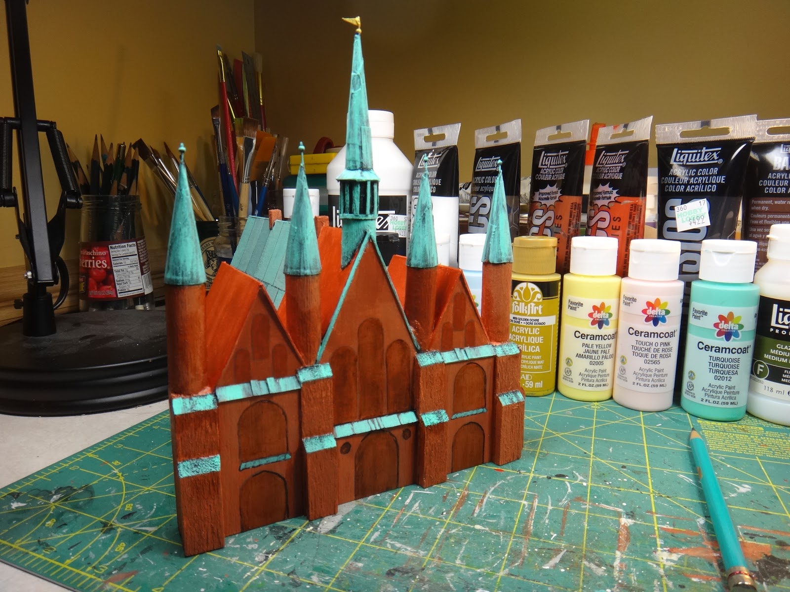
Taking a lunch break here in Zum Stollenkeller Mk. II at Totleigh-in-the-Wold, but I thought I'd share where we are in the process of suggesting windows and doors.  This one was the toughie!  Fairly smooth sailing from here on in with comparatively easy rectangles representing the doors and windows on the rest o the buildings.  All that is needed on the above hospital building though is the clock near the top of the central gable, two strips of "corroded cooper" stripping on the front edges of both shorter gables, and this particular wargaming structure will be done.  I plan to come back to those kinds of details a bit later though once the addition of stylized windows and doors has been completed on the rest of the buildings.

-- Stokes

Comments

Chris Kemp said…
Looking good! I would agree with you that stylised detail is the way to go.

Kind regards,

Chris
You've really nailed the copper! and the brick. Nice work all around.
Rob Young said…
These are turning out really well. I'm very impressed.

Rob
tidders said…
The weather copper effect has come out nicely

Windows are always tricky, I've tried a couple of things in the past to get some sort of glass effect
- greys with a gloss varnish
- thin clear plastic paint dark grey on the back and with a window frame stuck on top of the plastic and then that onto the building
Peter Douglas said…
This looks great Stokes. Love the copper roofs.
Peter
harada57 said…
This comment has been removed by the author.

Popular posts from this blog

And We're Off!!!

  Arrrgh!  Gotta go back into camera settings on my iPhone to bring all of the frame into focus.  Blast! Painting is underway on the 60 or so Minden Austrians, which are slated to become my version of the Anhalt-Zerbst Regiment of AWI renown.  More or less indistinguishable from Austrians of the era really, right down to the red facings and turnbacks, but the eventual flags (already in my files) will set them apart.   I went ahead and based-coated all of them over a couple of days lthe last week of August, using a mix of light gray and white acrylic gesso, before next applying my usual basic alkyd oil flesh tone to the faces and hands.  In a day or two, I'll hit that with Army Painter Flesh Wash to tone things down a bit and bring some definition to the faces and hands.   As usual, the plan is to focus on about 20 figures at a time, splitting the regiment roughly into thirds along with the color party and regimental staff.  Depending on ...

Sunday Morning Coffee with AI. . .

    A rmed with a second cup of fresh, strong coffee, I messed around a bit this morning with artlist.io using its image to image function in an attempt to convert my hand-drawn map from September 2006 to something that more resembles an old map from the mid-18th century.  And just like my experiments with Ninja AI in June, the results are mixed.   The above map is pretty good, but Artlist keeps fouling up the place names and has trouble putting a faint overlay of hexes across the entire area.  Hexes, admittedly, are not likely to be found on any genuine maps from the era in question, but there we are.  Frankly, I prefer the appearance of the Ninja map, but there were problems getting it to correct its errors.  Grrrr.  As is the case with so much having to do with the various AI's out there now, the output generated is a direct result of the prompts entered.  For text alone, and when you develop a lengthy, highly detailed prompt, it is...

Continued Regional Map Revisions. . .

F ooled around a bit more with the revised map just before and after dinner this evening, using the Fotor app to reinsert missing text .  I also removed a few other things using the 'Magic Eraser' function, which works surprisingly well.  Now, we're getting somewhere.  I just have to figure out how to ensure that the text is all a uniform font style and maybe figure out a way to add a few bunches of trees to suggest forested areas,  Ninja AI is not always entirely cooperative to the tune of "I'm sorry Dave.  I can't do that." -- Stokes